
Role
UI/UX Designer
Tools
Figma
FigJam
Maze
Zeplin
Team
Product Managers
Engineers
Research
Revenue/Merchandising
Brand
Platforms
Website (Responsive)
iOS App
Android App
Overview
Spirit's model is simple: sell the lowest base fare and let travelers pay only for what they use. That model lives or dies in the interface. If a traveler feels surprised by a fee, trust drops and so does conversion. If the interface hides useful options, ancillary revenue is left on the table. Over four years the design challenge was to keep fares low while making every choice clear, fast and fair.
Context and problem
Public history frames the starting point. Spirit launched a check-in-only app in 2017 and a second-generation app in 2018 that customers found missing basic functions. The airline then set out to become more of an e-commerce company, revamping its website and app to improve merchandising and conversion. Customer feedback from the period consistently pointed to the same themes:
• Fee anxiety: travelers could not see a running total until late in the flow.
• Dense, inconsistent UI: mixed type sizes and competing calls to action across web and app.
• Mobile gaps: flight alerts, trip changes and bag edits lagged behind customer expectations.
• Accessibility: the marketing site only partially met WCAG 2.1 AA, so contrast, focus and labeling needed work.
Goals
• Raise booking completion on mobile without lowering ancillary attach rate.
• Make the total price visible at every step.
• Unify web and app under one design system.
• Reach WCAG 2.1 AA on all booking surfaces.
• Reduce support contacts about bags, seats and changes.
Process and timeline
Year
Focus
Key Outcomes
2019
Audit and research
Heuristic audit of 40+ screens, 18 moderated sessions, journey map from search to boarding, prioritized friction list
2020
Foundations and pandemic response
First design system (type, color, components), flexible-travel messaging, contact-light check-in and boarding pass updates
2021
Booking flow redesign
Sticky trip summary, fare bundle cards, simplified search, A/B tests on bag and seat placement
2022
Bags and mobile parity
Bags redesign shipped in the app (Nov 2022), shared bag component on web, bundle naming alignment
2023
Accessibility and scale
WCAG 2.1 AA pass on booking, tokenized design system v2, handoff documentation and QA checklists
Research insights
• Price certainty beats lowest price. Participants chose a slightly higher bundle when a live total made the trade-off obvious.
• Bags are the moment of truth. Most hesitation happened on the bag step. Clear size visuals and weight limits reduced guessing.
• Mobile is the day-of-travel tool. Boarding pass, gate and delay alerts needed to be one tap away.
• People skim. Large price numerals, short labels and one primary action per screen outperformed dense tables.
Wireframes
Low-fidelity wireframes explored four mobile screens (search, select flight, bags and extras, boarding pass) and a desktop layout with a sticky trip summary. The goal was to settle information hierarchy before visual design.

Mobile designs
The high-fidelity app screens commit to Spirit’s yellow and black identity while using a calmer card layout. Fare bundles sit side by side so the trade-off between Basic, Bundle and Premium is visible without scrolling. A persistent footer carries the running total and a single Continue button.

Design decisions
• Pill buttons with a 48 px target for thumb reach and a consistent primary action.
• Price shown in the largest numerals on each fare card, with the included items listed beneath.
• Bundle upsell placed after individual bag choices so it reads as a saving, not a push.
• Boarding pass uses high-contrast yellow on black for glare outdoors.
Web mockups
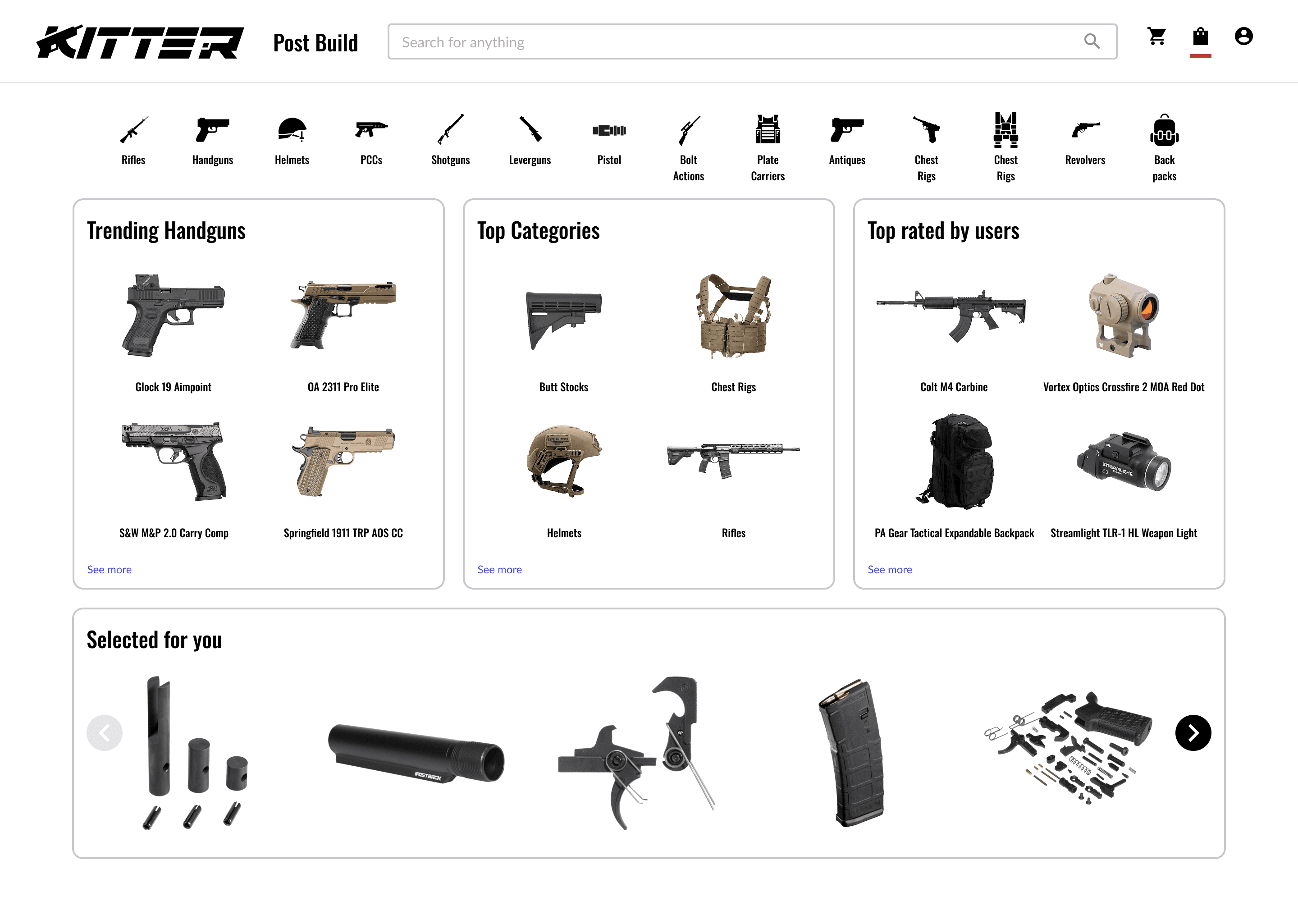
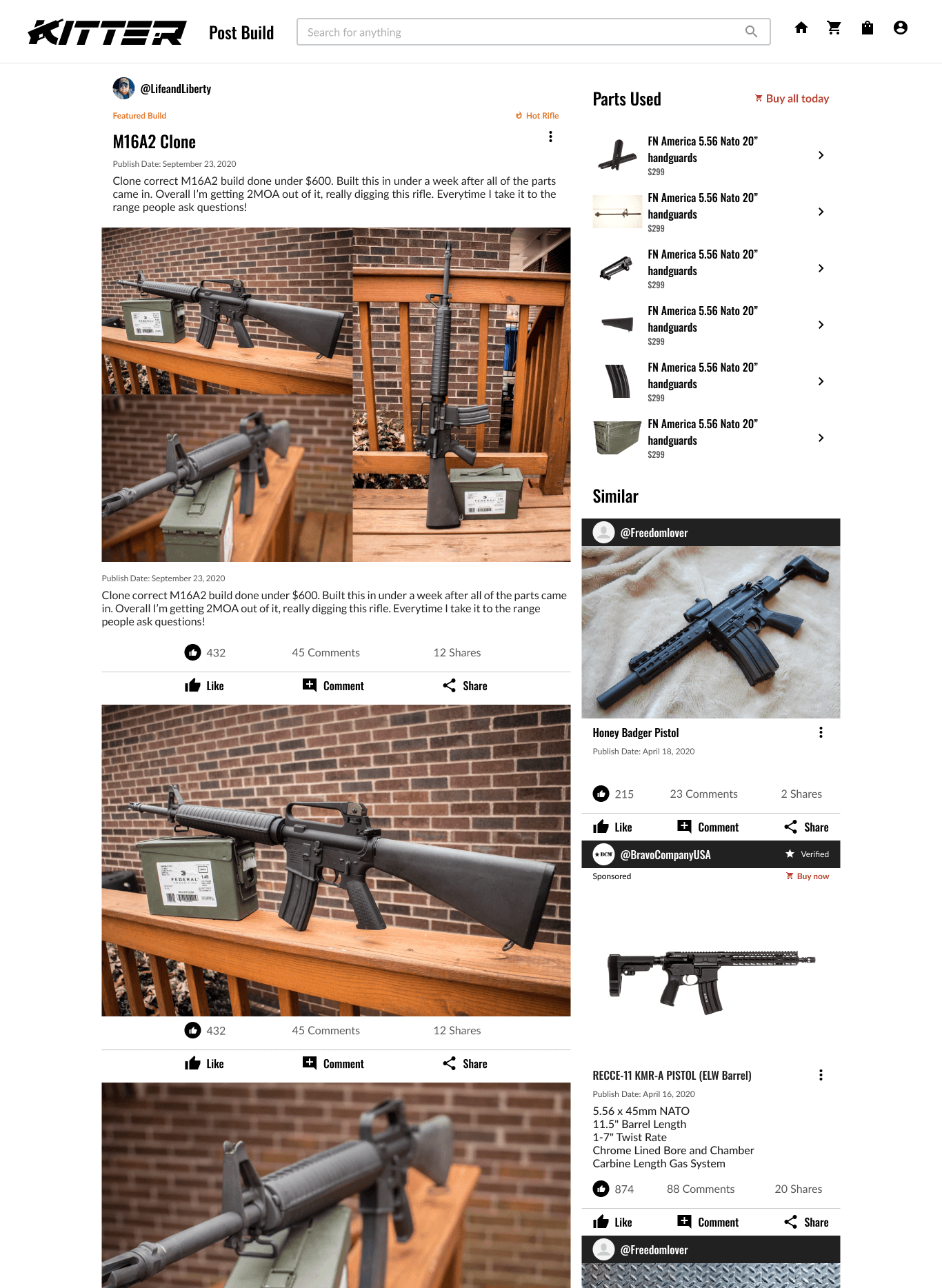
On desktop, the sticky trip summary keeps the base fare, taxes and extras visible as the traveler moves through the flow. The hero search card is the single focal point of the homepage.

Design system
The system moved from a loose component library to tokens for color, type, spacing and radius shared by web and app. It documents states, accessibility rules and usage guidance

Color Palette
We used Kitter’s neutral color palette, built around a range of grays for balance and clarity. The minimal tones maintain contrast and consistency while letting product imagery stand out.
Gray
HEX
#222222
RGB
34, 34, 34
Gray 2
HEX
#585858
RGB
58, 58, 58
Gray 3
HEX
#999999
RGB
153, 153, 153
Gray 4
HEX
#C8C8C8
RGB
200, 200, 200
Pure Black
HEX
#000000
RGB
0, 0, 0
Pure White
HEX
#FFFFFF
RGB
255, 255, 255
Off White
HEX
#F3F3F3
RGB
243, 243, 243
Gray 5
HEX
#E4E4E4
RGB
228, 228, 228
Typography
Oswald serves as Kitter’s heading typeface, chosen for its bold and condensed letterforms that convey strength and precision. Its clean, modern structure gives the interface a confident personality while ensuring legibility at various scales.
Lato complements Oswald by bringing warmth and balance to the overall design. Its open curves and even spacing make longer text easy to read, supporting usability across both web and mobile.
Oswald
Aa
ABCDEFGHIJKLMNOPQRSTUVWXYZ
abcdefghijklmnopqrstuvwxyz
1234567890
Lato
Aa
ABCDEFGHIJKLMNOPQRSTUVWXYZ
abcdefghijklmnopqrstuvwxyz
1234567890
Iconography
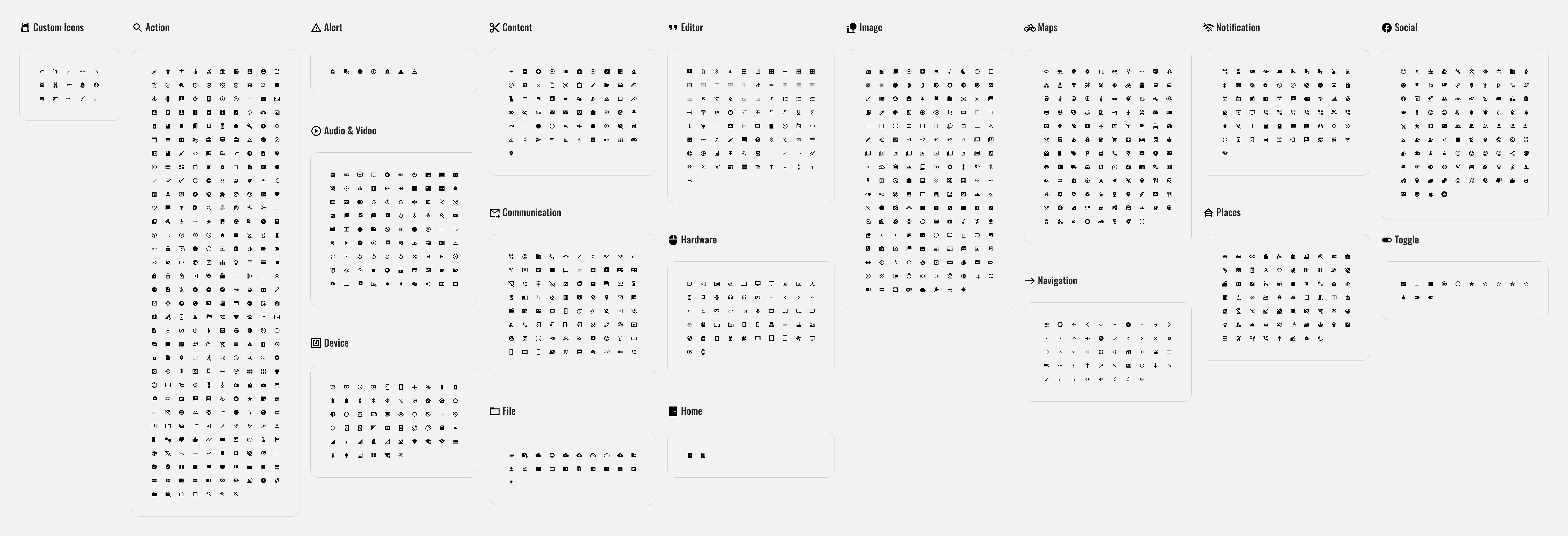
I used a mix of Material Symbols and custom icons designed to match their clean, geometric style. This combination kept the interface consistent, scalable, and aligned with Kitter’s unique visual identity.
Desktop Shots
4.USABILITY TESTING
Clarity in Design
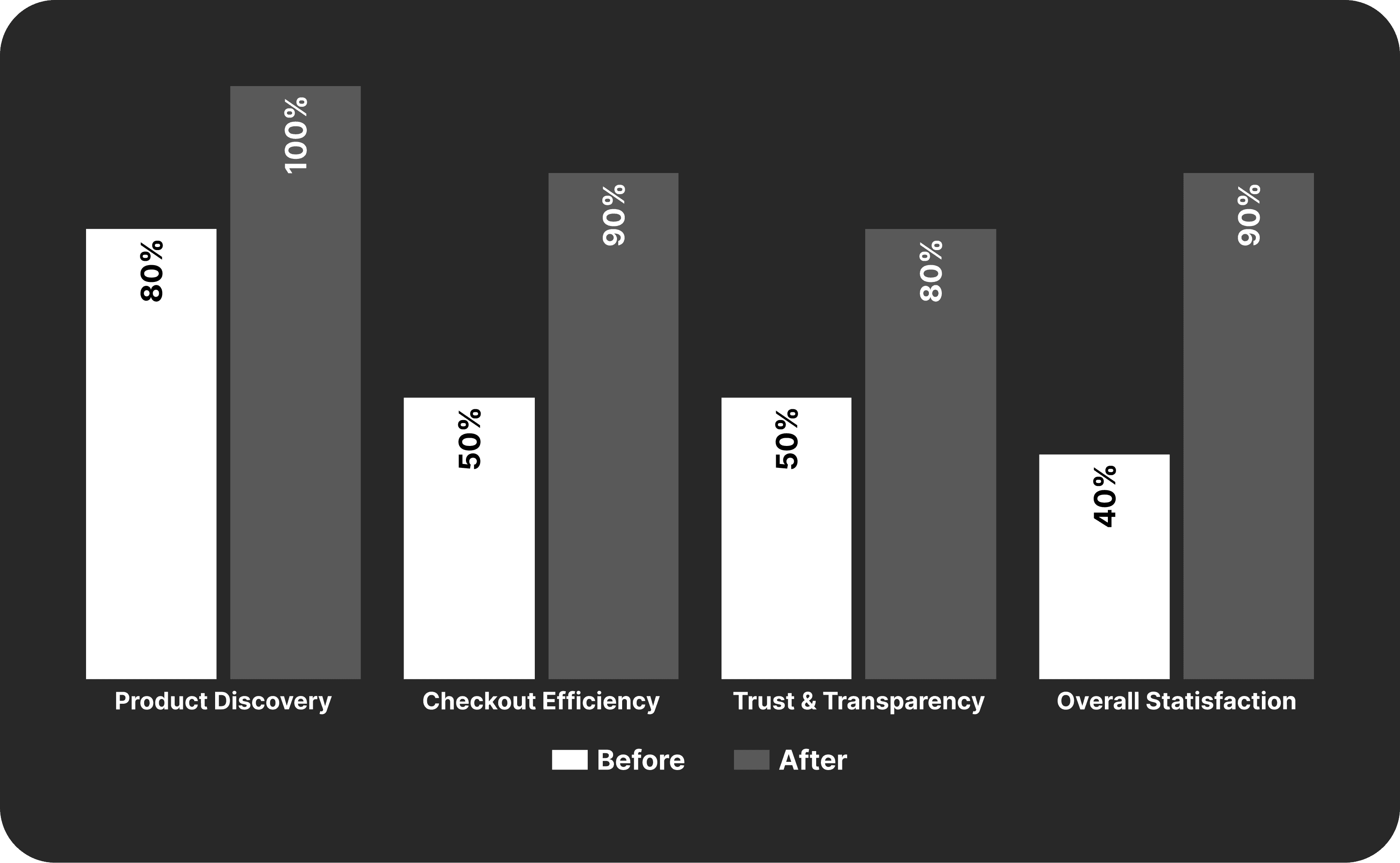
User testing showed measurable improvements in clarity, trust, and checkout efficiency, validating the design direction.
Product Discovery
After refining the prototype, users navigated the product catalog with ease. The participants successfully located specific items without guidance. Clear categorization and simplified filters reduced visual clutter and eliminated the sense of overwhelm reported during discovery.
Efficient Checkout
Participants described the checkout process as “quick” and “easy.” Condensed form fields and clear progress indicators helped users complete purchases confidently and without hesitation.
Trust and Confidence
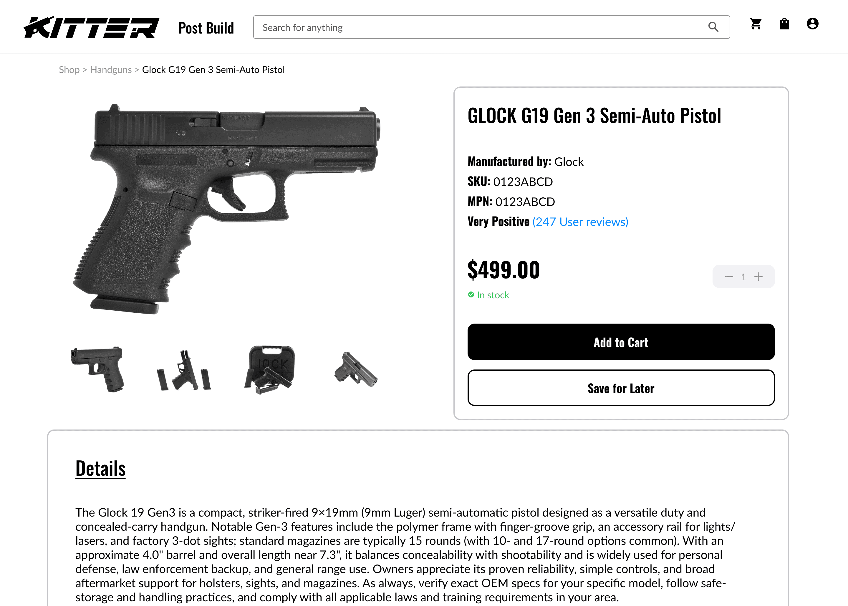
Displaying verified distributor details, clear return policies, and licensing information on product pages significantly improved user confidence. Participants described the interface as more “legitimate” and “secure,” reinforcing Kitter’s credibility as a licensed distributor.
Positive Perception
By combining cleaner visuals, faster checkout, and transparent product information, participants described the experience as “professional” and “reliable.” The prototype successfully balanced eCommerce efficiency with the assurance users expect from a licensed firearms distributor.
5.RESULTS & IMPACT
Where Research Met Results
User testing showed measurable improvements in clarity, trust, and checkout efficiency, validating the design direction.
Qualitative Insights
Testing with ten participants revealed strong improvements in clarity, trust, and overall user flow. Most users described the experience as clean, intuitive, and easy to navigate, with 90% completing checkout in under one minute. Participants said the interface felt “organized” and “reliable,” noting that clear hierarchy and consistent visuals made browsing and purchasing more straightforward.
Design Impact
The results confirmed that user-centered design choices effectively enhanced clarity, confidence, and task flow. Streamlined page structure and transparent product information helped reduce hesitation and decision fatigue. Consistent visual organization and simplified interactions created a smoother shopping experience that felt cohesive and trustworthy from start to finish.
6. CLOSING
My Final Thoughts
This project marked a defining chapter in my journey as a designer. As the sole UI/UX Designer on Kitter’s eCommerce expansion, I learned how to balance usability, brand identity, and trust while designing for both users and business goals. Beyond the deliverables, this project reinforced that great design isn’t just about how something looks, but how effortlessly it works for the people who use it.
Winning Moments
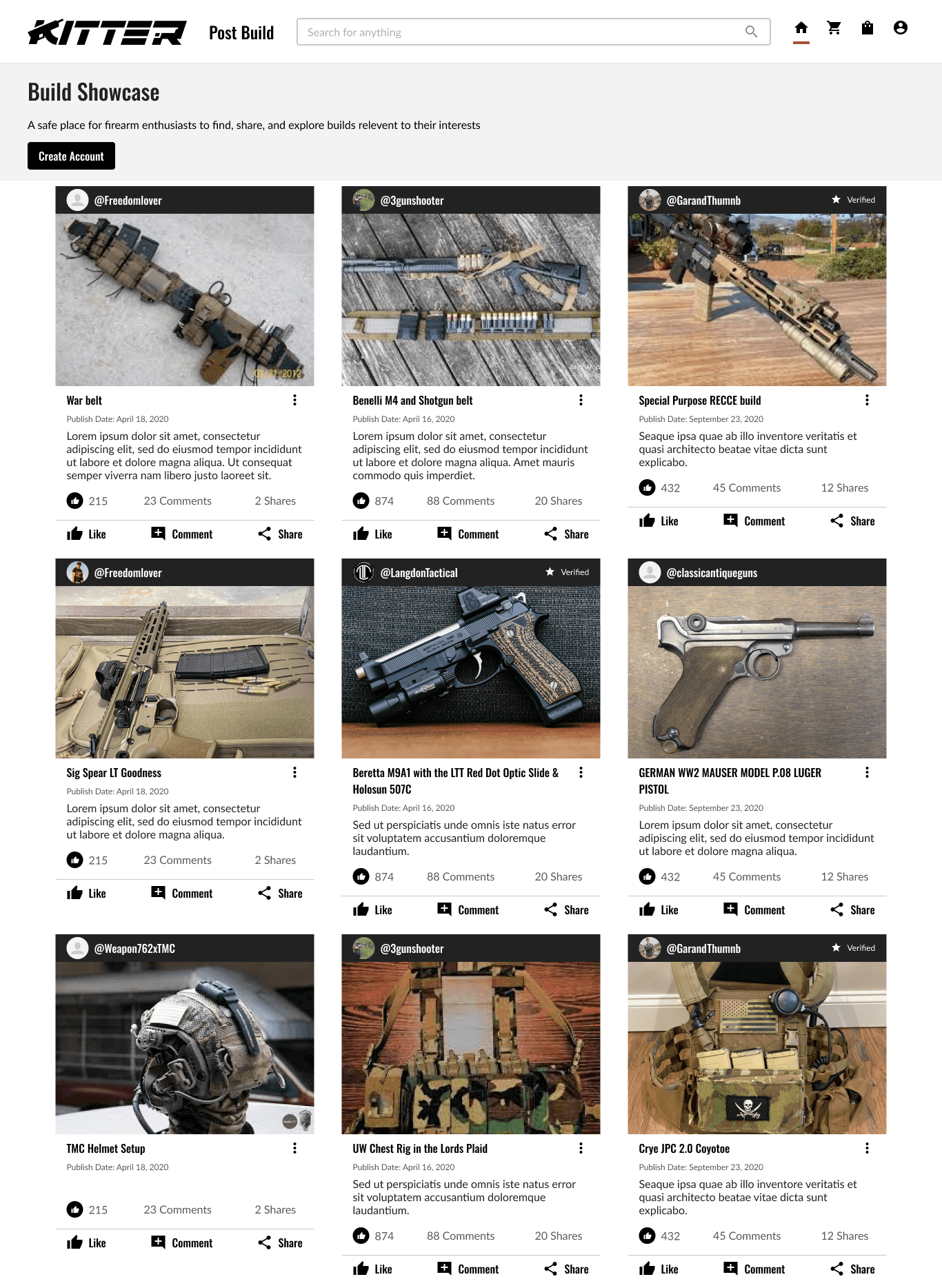
Integration: Successfully merging two distinct experiences, social engagement and eCommerce into a single, cohesive flow was a major milestone.
Familiarity: Anchoring the UX strategy in Jakob’s Law and the “power of boring” ensured that users instantly understood how to navigate the shop. By modeling the experience after familiar eCommerce patterns like Amazon’s, you reduced the learning curve, improved usability, and created an intuitive journey that balanced familiarity with brand personality.
Designing Solo, Delivering Big: I led the entire design process from research and wireframing to final high-fidelity mockups. Balancing stakeholder feedback, brand guidelines, and usability principles under tight timelines showcased my ability to think strategically, adapt quickly, and deliver results independently.
Lessons Learned
Simplicity: I learned that great design isn’t about doing something new for the sake of being different, it’s about making something that works beautifully. By leaning into familiar patterns and predictable flows, I saw firsthand how clarity and consistency drive user trust far more effectively than complexity ever could.
Collaborating: I had to work closely with developers and stakeholders to bring ideas to life. I learned that clear communication, thorough documentation, and visual consistency are essential when bridging design and development, especially in a fast-moving startup environment.
Continuous Process: Even though the eCommerce feature isn’t being implemented immediately, this project taught me that design doesn’t end at the final mockup. It’s about creating a foundation for future growth, building systems that can evolve as the company and its users do.